ui
ui
The ui module provides support for writing user interfaces.
A reminder to Android developers or high-level users, the UI system of CloudControl comes from Android, and all attributes and methods can be found in the Android source code. If some code or attributes do not appear in the CloudControl documentation, you can refer to the Android documentation.
View: https://developer.android.com/reference/android/view/View
Widget: https://developer.android.com/reference/android/widget/package-summary
The front of the script with ui must use "ui"; to specify the ui mode, otherwise the script will not run in the ui mode. Correct demonstration:
"ui";

//Other code of the script
Before string "ui" can have comments, blank lines and spaces [v4.1.0 new], but no other codes.
The interface is composed of views. View is divided into two types, widget and layout. Widgets are used to display text, pictures, web pages, etc., for example, text control (text) is used to display text, button control (button) can display a button and provide a click effect, and image control (img) is used to display Pictures from the Internet or files, in addition to the input box control (input), progress bar control (progressbar), radio check box control (checkbox), etc.; layout (Layout) is equipped with one or more controls The "container" is used to control the position of the controls in it. For example, the vertical layout (vertical) will display the controls in it from top to bottom (that is, the vertical arrangement), and the horizontal layout (horizontal) will place the controls inside it. The controls are displayed in order from left to right (that is, arranged horizontally), and the frame layout (frame), he will display the controls in him directly in the upper left corner, if there are multiple controls, the subsequent controls will overlap the previous controls .
We use xml to write the interface, and specify the layout xml of the interface through the ui.layout() function. for example:
"ui";
$ui.layout(
    <vertical>
        <button text="First button"/>
        <button text="Second button"/>
    </vertical>
);
In this example, the part from lines 3 to 6 is xml, which specifies the specific content of the interface. The label <vertical> ... </vertical> on the third line of the code indicates vertical layout. The layout label usually starts with <...> and ends with </...>, two The content between the tags is the content in the layout, such as <frame> ... </frame>. In this example, the content of lines 4 and 5 is the content in the vertical layout (vertical). The fourth line of the code is a button control (button). The label of the control usually starts with <... and ends with />. Between them are the specific attributes of the control, such as <text ... / >. In this example, the part of text="first button" is the attribute of the button control (button), which specifies the text content (text) of this button control as "the first button".
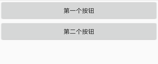
The 5th line of the code is the same as the 4th line, which is also a button control, except that its text content is "the second button". These two controls are in a vertical layout, so they will be arranged vertically, the effect is as shown in the figure:
If we change the vertical layout (vertical) of this example to horizontal layout (horizontal), that is:
"ui";
ui.layout(
    <horizontal>
        <button text="First button"/>
        <button text="Second button"/>
    </horizontal>
);
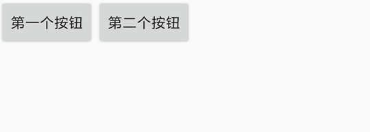
The two buttons will be arranged horizontally, and the effect is as shown in the figure:
A control can specify multiple attributes (or even no attributes), separated by spaces; the layout can also specify attributes, for example:
"ui";
ui.layout(
    <vertical bg="#ff0000">
        <button text="First button" textSize="20sp"/>
        <button text="Second button"/>
    </vertical>
);
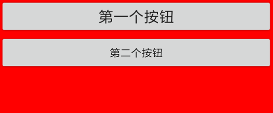
The third line bg="#ff0000" specifies the background color (bg) of the vertical layout as "#ff0000", which is an RGB color, which means red (for related knowledge of RGB, please refer to [RGB color comparison table] (http 😕/tool.oschina.net/commons?type=3)). The fourth line of textSize="20sp" specifies the font size (textSize) of the button control as "20sp", and sp is a font unit, so don't worry about it in depth for now. The effect of the above code is as follows:
An interface consists of several layouts and controls. In order to facilitate the reading of the document, let us explain the following terms:
- Sub-view, sub-control: The control in the layout is the sub-control/sub-view of this layout. In fact, there are not only controls in the layout, but also nested layouts. Therefore, it is more accurate to use Child View. In the above example, the button is the child control of the vertical layout.
- Parent view, parent layout: The layout that directly contains a control is the parent layout/parent view of this control. In the above example, the vertical layout is the parent layout of the button.
View: View
Controls and layouts belong to the view (View). In this chapter, we will introduce the common properties and functions of all controls and layouts. For example, attribute background, width and height, etc. (all controls and layouts can set the background and width and height), the function click() sets the action performed when the view is clicked.
attr(name, value)
name{string} attribute namevalue{string} The value of the attribute
Set the value of the attribute. The attribute designation is the attribute of View in xml. For example, you can use the statement attr("text", "text") to set the text value of the text control.
"ui";

$ui.layout(
    <frame>
        <text id="example" text="Hello"/>
    </frame>
);

// execute after 5 seconds
$ui.post(() => {
    // modify the text
    $ui.example.attr("text", "Hello, CloudControl UI");
    // modify background
    $ui.example.attr("bg", "#ff00ff");
    // modify the height
    $ui.example.attr("h", "500dp");
}, 5000);
Note: Not all properties can be set in js code. Some properties can only be set when the layout is created, such as the style property. Although some properties can be set in code, they are not yet supported; for these In case, CloudControl Pro 8.1.0+ will throw an exception, other versions will not throw an exception.
attr(name)
name{string} attribute name- Return {string}
Get the value of the attribute.
"ui";

$ui.layout(
    <frame>
        <text id="example" text="1"/>
    </frame>
);

plusOne();

function plusOne() {
    // Get text
    let text = $ui.example.attr("text");
    // parse as a number
    let num = parseInt(text);
    // number plus 1
    num++;
    // set text
    $ui.example.attr("text", String(num));
    // continue in 1 second
    $ui.post(plusOne, 1000);
}
w
The width of the View is an abbreviation of the attribute width. The values that can be set are *, auto and specific values. Among them, * means width fill the parent layout as much as possible, and auto means that the width will be automatically adjusted according to the content of the View (adaptive width). E.g:
"ui";
ui.layout(
    <horizontal>
        <button w="auto" text="Adaptive width"/>
        <button w="*" text="Fill the parent layout"/>
    </horizontal>
);
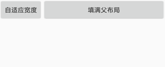
In this example, the first button is an adaptive width, and the second button is to fill the parent layout. The display effect is:
If this property is not set, different controls and layouts have different default widths, most of which are auto.
The width attribute can also specify a specific value. For example, w="20", w="20px", etc. Without a unit, the default unit is dp, and other units include px (pixel), mm (millimeter), and in (inch). For more information about the unit of dimensions, see [Unit of Dimensions: Dimension](#ui_Dimensional Unit_Dimension).
"ui";
ui.layout(
    <horizontal>
        <button w="200" text="Width 200dp"/>
        <button w="100" text="Width 100dp"/>
    </horizontal>
);
h
The height of the View is an abbreviation of the property height. The values that can be set are *, auto and specific values. Among them, * means width fill the parent layout as much as possible, and auto means that the width will be automatically adjusted according to the content of the View (adaptive width).
If this property is not set, different controls and layouts have different default heights, most of which are auto.
The width attribute can also specify a specific value. For example, h="20", h="20px", etc. Without a unit, the default unit is dp, and other units include px (pixel), mm (millimeter), and in (inch). For more information about the unit of dimensions, see [Unit of Dimensions: Dimension](#ui_Dimensional Unit_Dimension).
id
View id is used to distinguish different controls and layouts under an interface. The id of an interface is usually unique under the same interface, that is, generally there is no two Views with the same id. The id attribute is also a bridge connecting the xml layout and JavaScript code. In the code, you can get this View through the id of a View and perform operations on it (set click actions, set attributes, get attributes, etc.). E.g:
"ui";
ui.layout(
    <frame>
        <button id="ok" text="OK"/>
    </frame>
);
//Get the button control through ui.ok
toast(ui.ok.getText());
In this example, there is a button control "OK", the id attribute is "ok", then we can use ui.ok in the code to get it, and then get the text content of this button control through the getText() function . In addition, the frame layout (frame) is used in this example because we only have one control, so it is used for the simplest layout frame layout.
gravity
The "gravity" of the View. Used to determine the position of the View content relative to the View, the values that can be set are:
leftto the leftrightto the righttopto the topbottomto the bottomcentercenter_verticalvertical centercenter_horizontalhorizontally centered
For example, for a button control, gravity="right" will make theThe text content is displayed to the right. E.g:
"ui";
ui.layout(
    <frame>
        <button gravity="right" w="*" h="auto" text="right text"/>
    </frame>
);
The display effect is:
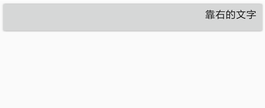
These attributes can be combined. For example, the content of the View of gravity="right|bottom" will be in the lower right corner.
layout_gravity
The "gravity" of the View in the layout is used to determine the position of the View itself in its parent layout. The value that can be set is the same as the gravity attribute. Pay attention to distinguish this attribute from the gravity attribute.
"ui";
ui.layout(
    <frame w="*" h="*">
        <button layout_gravity="center" w="auto" h="auto" text="centered button"/>
        <button layout_gravity="right|bottom" w="auto" h="auto" text="the button in the lower right corner"/>
    </frame>
);
In this example, we make the size of the frame layout (frame) fill the entire screen, by setting the attribute layout_gravity="center" to the first button to center the button in the frame layout, and setting the second button The attribute layout_gravity="right|bottom" makes it in the lower right corner of the frame layout. The effect is as follows:
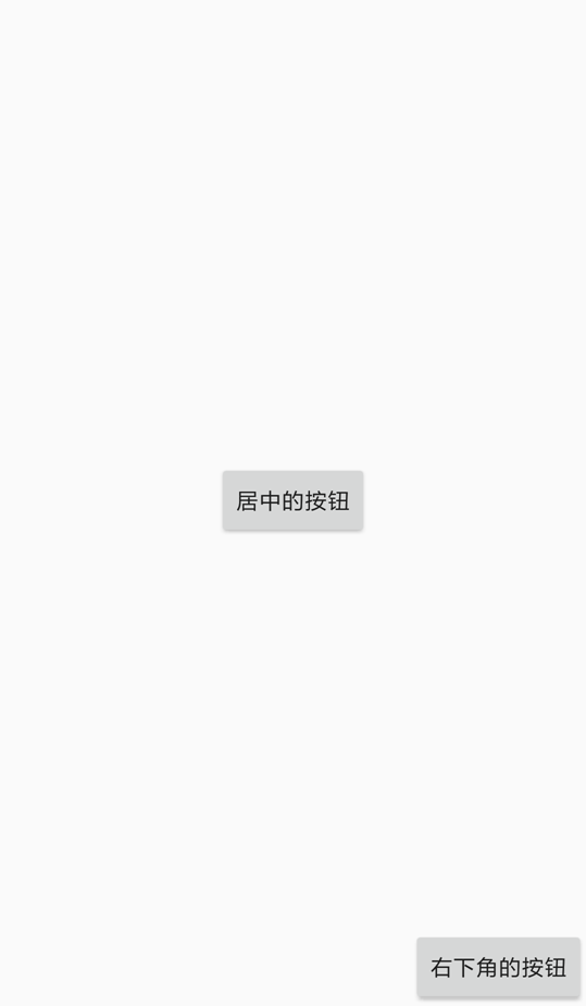
It should be noted that the attribute of layout_gravity may not always be effective, depending on the type of layout. For example, the first child control in the horizontal layout cannot be displayed at the bottom (otherwise it is contrary to the horizontal layout itself).
margin
Margin is the distance between the View and other Views, that is, the outer margin. The margin attribute includes four values:
marginLeftleft marginmarginRightright marginmarginTopupper marginmarginBottombottom margin
The value of the margin attribute itself can have three formats:
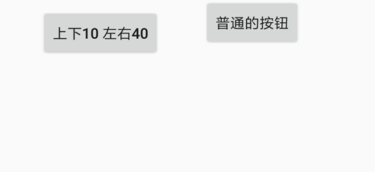
margin="marginAll"specifies that each margin is the same value. For example,margin="10"means that the left and right margins are 10dp.margin="marginLeft marginTop marginRight marginBottom"specify each margin separately. For example,margin="10 20 30 40"means that the left margin is 10dp, the top margin is 20dp, the right margin is 30dp, and the bottom margin is 40dpmargin="marginHorizontal marginVertical"specifies the horizontal and vertical margins. For example,margin="10 20"means that the left and right margins are 10dp, and the top and bottom margins are 20dp.
Use an example to specifically understand the meaning of margins:
"ui";
ui.layout(
    <horizontal>
        <button margin="30" text="30 from all around"/>
        <button text="Normal button"/>
    </horizontal>
);
The margin attribute of the first button specifies that its margin is 30dp, that is, the distance between him and the horizontal layout and the second button are both 30dp, and the display effect is as follows:
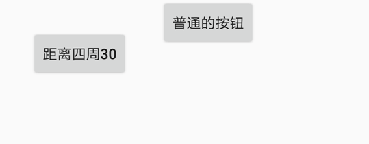
If you change margin="30" to margin="10 40", then the left and right spacing of the first button is 10dp, and the top and bottom spacing is 40dp, the effect is as follows:
For the unit of the margin attribute, see [Unit of Dimensions: Dimension](#ui_Dimensional Unit_Dimension).
marginLeft
The left margin of the View. If this attribute conflicts with the value specified by the margin attribute, the following attributes will take effect, and the preceding attributes will be invalid. For example, the left margin of margin="20" marginLeft="10" is 10dp, and the other margins are 20dp.
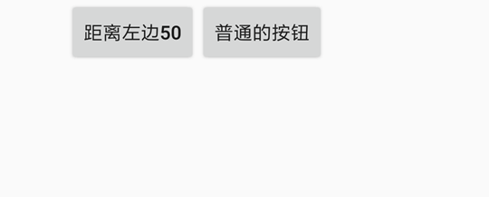
"ui";
ui.layout(
    <horizontal>
        <button marginLeft="50" text="50 from the left"/>
        <button text="Normal button"/>
    </horizontal>
);
The first button specifies a left margin of 50dp, then the left margin of the horizontal layout (horizontal) between him and his parent layout is 50dp, the effect is as follows:
marginRight
The right margin of the View. If this attribute conflicts with the value specified by the margin attribute, the latter attribute takes effect and the previous attribute is invalid.
marginTop
The top margin of the View. If this attribute conflicts with the value specified by the margin attribute, the latter attribute takes effect and the previous attribute is invalid.
marginBottom
The bottom margin of the View. If this attribute conflicts with the value specified by the margin attribute, the latter attribute takes effect and the previous attribute is invalid.
padding
The distance between the View and its own content, that is, the inner margin. Note that to distinguish it from the margin property, the margin property is the spacing between the View, and padding is the spacing between the View and its own content. For example, the padding of a text control is the distance between the edge of the text control and its text content, and paddingLeft is the distance between the left side of the text control and its text content.
The value of the padding attribute also has three formats:
padding="paddingAll"specifies that each padding is the same value. For example,padding="10"means that the left, right, top, and bottom padding are both 10dp.padding="paddingLeft paddingTop paddingRight paddingBottom"specify each padding separately. For example,padding="10 20 30 40"means that the left padding is 10dp, the top padding is 20dp, the right padding is 30dp, and the bottom padding is 40dp.padding="paddingHorizontal paddingVertical"specifies the horizontal padding and vertical padding. For example,padding="10 20"means that the left and right padding is 10dp, and the top and bottom padding is 20dp.
Use an example to specifically understand the meaning of padding:
"ui";
ui.layout(
    <frame w="*" h="*" gravity="center">
        <text padding="10 20 30 40" bg="#ff0000" w="auto" h="auto" text="HelloWorld"/>
    </frame>
);
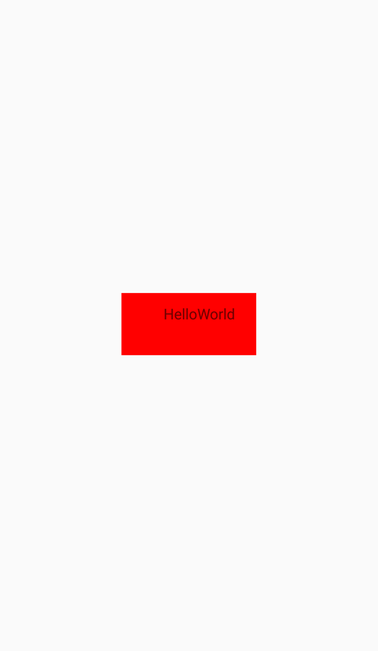
This example is a centered button (set by the gravity="center" property of the parent layout), the background color is red (bg="#ff0000"), the text content is "HelloWorld", and the left margin is 10dp. The top margin is 20dp, the bottom margin is 30dp, and the right margin is 40dp. The display effect is as follows:
paddingLeft
The left inner margin of the View. If this attribute conflicts with the value specified by the padding attribute, the latter attribute takes effect and the previous attribute is invalid.
paddingRight
The right inner margin of the View. If this attribute conflicts with the value specified by the padding attribute, the latter attribute takes effect and the previous attribute is invalid.
paddingTop
The top padding of the View. If this attribute conflicts with the value specified by the padding attribute, the latter attribute takes effect and the previous attribute is invalid.
paddingBottom
The bottom padding of the View. If this attribute conflicts with the value specified by the padding attribute, the latter attribute takes effect and the previous attribute is invalid.
bg
View background. The value can be an image pointed to by a link or path, or a color in RGB format, or other background. See Drawables for details.
For example, bg="#00ff00" sets the background to green, bg="file:///sdcard/1.png" sets the background to the picture "1.png", bg="?attr/selectableItemBackground"Set the background to the ripple effect that appears when you click (may need to set clickable="true" at the same time to take effect).
alpha
The transparency of the View, its value is a decimal between 0 and 1, 0 means completely transparent, 1 means completely opaque. For example, alpha="0.5" means semi-transparent.
foreground
View the foreground. The foreground is the content displayed on the content of a View, which may overwrite the content of the View itself. Its value is similar to the value of the attribute bg.
minHeight
The minimum height of the View. This value is not always effective, depending on whether the parent layout has enough space to accommodate it.
Example: <text height="auto" minHeight="50"/>
For the unit of this attribute, see [Unit of Dimensions: Dimension](#ui_Dimensional Unit_Dimension).
minWidth
The minimum width of the View. This value is not always effective, depending on whether the parent layout has enough space to accommodate it.
Example: <input width="auto" minWidth="50"/>
For the unit of this attribute, see [Unit of Dimensions: Dimension](#ui_Dimensional Unit_Dimension).
visibility
The visibility of the View, this property can determine whether the View is displayed. Its value can be:
goneis not visible.visibleis visible. Views are visible by default.invisibleis not visible, but still occupies space.
rotation
The rotation angle of the View. Through this attribute, the View can be rotated clockwise by a certain angle. For example, rotation="90" can make him rotate 90 degrees clockwise.
If you want to set the center of rotation, you can set it through the transformPivotX, transformPivotY properties. The default rotation center is the center of the View.
transformPivotX
The coordinate x of the transformation center of the View. The center coordinates used for the rotation, scaling, and other transformations of the View. For example, transformPivotX="10".
The coordinate system of this coordinate takes the upper left corner of the View as the origin. That is, the x value is the distance from the center of the transformation to the left side of the View.
For the unit of this attribute, see [Unit of Dimensions: Dimension](#ui_Dimensional Unit_Dimension).
transformPivotY
The transformation center coordinate y of the View. The center coordinates used for the rotation, scaling, and other transformations of the View. For example, transformPivotY="10".
The coordinate system of this coordinate takes the upper left corner of the View as the origin. That is, the y value is the distance from the transform center to the upper edge of the View.
For the unit of this attribute, see [Unit of Dimensions: Dimension](#ui_Dimensional Unit_Dimension).
style
Set the style of the View. Different controls have different optional built-in styles. See the description of each control for details.
It should be noted that the style attribute only supports Android 5.1 and above.
Text control: text
The text control is used to display text, you can control the font size, font color, font, etc. of the text.
The following introduces the main properties and methods of the control. If you want to view all of its properties and methods, please read TextView.
text
Set the content of the text. For example, text="a piece of text".## textColor
Set the color of the font. It can be a color in RGB format (such as #ff00ff), or a color name (such as red, green, etc.). For details, see Color.
Example, red font: <text text="red font" textColor="red"/>
textSize
Set the font size, the unit is usually sp. According to Material Design's specifications, the body font size is 14sp, the title font size is 18sp, and the subtitle font size is 16sp.
Example, super large font: <text text="super large font" textSize="40sp"/>
textStyle
Set the font style, such as italic, bold, etc. The optional values are:
- bold bold font
- italic italic
- normal normal font
You can use or ("|") to combine them, such as "bold|italic" in bold and italic.
For example, bold: `
lines
Set the number of lines of the text control. Even if the text content does not reach the set number of lines, the control will leave a corresponding width to display blank lines; if the text content exceeds the set number of lines, the excess part will not be displayed.
In addition, multiple lines of text cannot be set in xml, and should be set in the code. E.g:
"ui";
ui.layout(
    <vertical>
        <text id="myText" line="3">
    </vertical>
)
//Pass through \n to wrap
ui.myText.setText("The first line\nThe second line\nThe third line\nThe fourth line");
maxLines
Set the maximum number of lines of the text control.
typeface
Set the font. The optional values are:
normalnormal fontsansserif fontserifsans serif fontmonospacemonospace font
Example, monospace font: <text text="monospace font" typeface="monospace"/>
ellipsize
Set the ellipsis position of the text. The ellipsis of the text will be displayed when the text content exceeds the text control. The optional values are:
enddisplays an ellipsis at the end of the textmarqueemarquee effect, the text will be scrolledmiddledisplays an ellipsis in the middle of the textnonedoes not display the ellipsisstartdisplays an ellipsis at the beginning of the text
ems
When this property is set, the character length displayed by the TextView (unit is em), the excess part will not be displayed, or the ellipsis will be displayed according to the setting of the ellipsize property.
For example, to limit text to a maximum of 5em: `
autoLink
Control whether links such as url and email address are automatically found and converted into clickable links. The default value is "none".
Setting this value can make the links, phone calls, etc. in the text clickable.
The optional value is a combination of the following values through or ("|"):
allmatches all connections, emails, addresses, phone numbersemailmatches email addressmapmatches the map addressnonedoes not match (default)phonematches phone numberwebmatches URL address
Example: <text autoLink="web|phone" text="Baidu: http://www.baidu.com Telecom phone: 10000"/>
Button control: button
The button control is a special text control, so all the function properties of the text control are applicable to the button control.
In addition, the button control has some built-in styles, which are set through the style property, including:
- Widget.AppCompat.Button.Colored button with color
- Widget.AppCompat.Button.Borderless borderless button
- Widget.AppCompat.Button.Borderless.Colored borderless button with color
For the specific effects of these styles, please refer to "Sample/Interface Control/Button Control.js".
For example: <button style="Widget.AppCompat.Button.Colored" text="Beautiful button"/>
Input box control: input
The input box control is also a special text control, so all the properties and functions of the text control function are applicable to the button control. The input box control has its own attributes and functions. To view all of these, read EditText.
For an input box control, we can set its content through the text attribute, and specify the number of lines in the input box through the lines attribute; get the input content through the getText() function in the code. E.g:
"ui";
ui.layout(
    <vertical padding="16">
        <text textSize="16sp" textColor="black" text="Please enter your name"/>
        <input id="name" text="小明"/>
        <button id="ok" text="OK"/>
    </vertical>
);
//Specify the action to be performed when the OK button is clicked
ui.ok.click(function(){
    //Get the input content through getText()
    var name = ui.name.getText();
    toast(name + "Hello!");
});
In addition, the input box control has other main properties (although these properties are also available for text controls, they are generally only used for input box controls):
hint
Enter the prompt. This prompt will be displayed when the input box is empty.
The code for the above picture effect is:
"ui";
ui.layout(
    <vertical>
        <input hint="Please enter your name"/>
    </vertical>
)
textColorHint
Specify the font color of the input prompt.
textSizeHint
Specify the font size of the input prompt.
inputType
Specify the type of text that can be entered in the input box. The optional values are the following values and their combination with "|":
dateis used to enter the date.datetimeis used to enter the date and time.nonehas no content type. This input box cannot be edited.numbercan only enter numbers.numberDecimalcan be combined with number and its other options to allow input of decimal numbers (including decimals).numberPasswordcan only enter a number password.numberSignedcan be combined with number and its other options to allow the input of signed numbers.phoneis used to enter a phone number.textis just normal text.textAutoCompletecan be combined with text and its other options to specify that this field will do its own auto-completion and interact with the input method appropriately.textAutoCorrectcan be combined with text and its other options to request automatic text input error correction.textCapCharacterscan be combined with text and its other options to request all characters in uppercase.textCapSentencescan be combined with text and its other options to request capitalization of the first character in each sentence.textCapWordscan be combined with text and its other options to request that the first character in each word be capitalized.textEmailAddressis used to enter an email address.textEmailSubjectis used to enter the subject of the email.textImeMultiLinecan be combined with text and its other options to indicate that although the regular text view should not be multi-line, if possible, IME should provide multi-line support.textLongMessageis used to enter the content of a long message.textMultiLinecan be combined with text and its other options to allow multiple lines of text in the field. If this flag is not set, the text field will be restricted to a single line.textNoSuggestionscan be combined with text and its other options to indicate that the input method should not display any dictionary-based word suggestions.textPasswordis used to enter the password.textPersonNameis used to enter a person's name.textPhoneticis used to enter text that is pronounced in pinyin, such as the pinyin name field in a contact entry.textPostalAddressis used to enter the postal address.textShortMessageis used to input short message content.textUriis used to enter a URI.textVisiblePasswordis used to enter a visible password.textWebEditTextis used to enter the text in the web form.textWebEmailAddressis used to enter an email address in a web form.textWebPasswordis used to enter a password in a web form.timeis used to enter the time.
For example, if you want to specify the input type of an input box as a decimal number, it is: <input inputType="number|numberDecimal"/>
password
Specify whether the input box is a password input box. The default is false.
For example: <input password="true"/>
numeric
Specify whether the input box is a number input box. The default is false.
For example: <input numeric="true"/>
phoneNumber
Specify whether the input box is a phone number input box. The default is false.
For example: <input phoneNumber="true"/>
digit
Specify the characters that can be entered in the input box. For example, to specify that the input box can only enter "1234567890+-", it is <input digit="1234567890+-"/>.
singleLine
Specify whether the input box is a single-line input box. The default is false. You can also specify a single-line input box with lines="1".
For example: <input singleLine="true"/>
Picture control: img
The picture control is used to display pictures from the network, local or embedded data, and can specify the pictures to be displayed in rounded rectangles, circles, etc. But it cannot be used to display animated gif images.
Here only introduces his main methods and attributes. If you want to view all of his methods and attributes, read ImageView.
src
Use a Uri to specify the source of the picture. It can be the address of the image (http://....), the local path (file://....) or the base64 data ("data:image/png;base64,...").
If you use the image address or local path, CloudControl will automatically use the appropriate cache to store these images, reducing the time to load the next time.
For example, to display the logo of Baidu:
"ui";
ui.layout(
    <frame>
        <img src="https://www.baidu.com/img/bd_logo1.png"/>
    </frame>
);
For another example, the picture showing the file /sdcard/1.png is <img src="file:///sdcard/1.png"/>. For another example, make base64 display a small wallet picture as:
"ui";
ui.layout(
    <frame>
        <Img w = "40" h = "40" src = "data: image / png; base64, iVBORw0KGgoAAAANSUhEUgAAADwAAAA8CAYAAAA6 / NlyAAAACXBIWXMAAA7EAAAOxAGVKw4bAAAEu0lEQVRoge3bW4iVVRQH8N + ZnDKxvJUGCSWUlXYle / ChiKAkIiu7UXQjonwNIopM8cHoAhkRGQXdfIiE0Ep8KalQoptRTiFFZiRlOo6TPuSk4zk97G9w5vidc77LPjNi84f1MN + 391rrf9a + rL32N4xiFMcUjouo5zyciYPYH0FnBadiNiZiD2oR9JbGRdgiOFPDIXRhCWYU0Dcj6duV6BrQuyWxNaLowBcOO1Uv + 7EKc4WINUIlabMq6dNI35eJzRHDWOzS2MEB6cd6XI / OQf07k2frkzat9HQnNkcUG7R2dECq2I53EtmePMvaf + MwcWqKu + RzuqhUcfcwcWqKTvmiXFQ2GDodRhQz0aN9ZHsSG0cVrkGf + GT7MG8YeeTCHeKS7sOdMR1stjcWxY2YH0nXh1gdSdf / E + 2I8KVYigkl9ewVUsxNpT1qMzaKN4ejJxrtyEt7IuraE1EX2jOkp + JBnFxSzz68KuTqoyiK2BHuxDO4NpK + j / GoOAWF6BiH98Q / SHyCycPIIxMm4FPZCPTj30SynIFr + A7ThotMK4wXopA1Ym9gSiKv5Oj3bdKnFMpuS514E1fm6NMnbF098s3NS4QS0Ik5 + hyBsoSXYkGO9jvxy6C / t + IPIYJZcBWW57AXFfMNrSo2kqqw2l4hvSzcIRTw1sm24FVxb5s4NcR0 / JXBuUNYJttI6sDjsi1kvTgrGpsMjq3O4FQNa + SbNhWsyKj7I4wpzSYDbpFtKB / EOSn9ZwpRfx5Xp7yfhN0Z9FdxXxxKjTEe2zI4U8NnKf3PNrT2VcWTKe1eyGjjT + Eapm14IqMjNTyd0n9JSrsDwhmaEN2H8GMOO8viUjyMSfJVJh9O0bGoQdt1eFm2oVwve7 UpC1ssX568KEXH6fghp54s8lRkrk7CjpxOrGqg6wQ8IKSKWXPpVtIt8ly + v4ATf2t + yqlgDl5SbCjXy8JIXFXweQEHqngxo43JeEw54l + JVLKaJeypRZzoFxavrIWG6cKPW2SO9 + PCMkQHsLiA8fpIv5 / DmUn4qaCtpWWIEiLzdUHj9XJA2H5uFRbBZriuoI1NSpatpio + nJtFvFvYd2c1sDsGvxfQ3a / knrwgMtm0qD8rPSprCuq8uRmhVqvanBbvm + EQfsNKIcnvTmnTiUdwQcq73oJ2L2v2stXx6vyCRr8RDuk / C8OMUK24J6VtBaekPG81zxuh0TTJhC7FhtUOHF + n61whGalvu8uRWVJFvgPEYOkqQzhLVSPPXLoYa4Xh3Stcls1NaTdb8Xx7ZxnCvSUIfy / kzWno0Pyzx3dL2C0695Hto7NGUhXy5Lzp3kLZKiqNpNTl2 + YShgdIvyXbVck44TB / oKTNzWUIv13S + IDsFmpY84QvZAcwTbh4e04o18SwtbIM4dsiOTFYVgzSv7wN + m9vRqjV / PrA0JuCox1bhYNKQ7Qi3CcU1fpiedRG9AkLXhRfbxCnKlET0s21ifwaSWcPbopBdDDOwGtClTD2vCsq + / C68K8HmVDk7DhFyIsvFzKnGThN + 689 + oU9dptwQb5B + LB8dx4lMb7xqAhkJwo / xljhFFSfSdUc3mPrcbwj15P + pP0 / QiR7hYSkGsHnUYziWMF / mXV4JVcZ8G0AAAAASUVORK5CYII = "/>
    </frame>
);
tint
The image is colored, and its value is a color name or RGB color value. Using this attribute will paint all non-transparent areas in the picture with the same color. Can be used to change the color of the picture.
For example, for the base64 image above: <img w="40" h="40" tint="red" src="data:image/png;base64,..."/>, the color of the wallet icon Will turn red.
scaleType
Control the mode when the picture is scaled according to the width and height of the picture control. The optional values are:
centerdisplays the image in the center of the control, but does not perform zooming.centerCropkeeps the aspect ratio of the image and zooms the image so that the size (width and height) of the image is equal to or greater than the corresponding size of the control (excluding padding) and the image is displayed in the center of the control.centerInsidekeeps the aspect ratio of the image and zooms the image so that the size (width and height) of the image is smaller than the corresponding size of the view (excluding padding) and the image is displayed in the center of the control.fitCenterkeeps the aspect ratio of the image and zooms the image, so that the width** or **height of the image is the same as the width and height of the control and the image is displayed in the center of the controlfitEndkeeps the aspect ratio of the image and zooms the image so that the width** or **height of the image is the same as the width and height of the control and the image is displayed in the lower right corner of the controlfitStartkeeps the aspect ratio of the image and zooms the image so that the width** or **height of the image is the same as the width and height of the control and the image is displayed in the upper left corner of the controlfitXYmakes the picture and the width and height exactly match the width and height of the control, but the aspect ratio of the picture may not be consistentmatrixuses the image matrix for scaling when drawing. Need to use thesetImageMatrix(Matrix)function in the code to take effect.
The default scaleType is fitCenter; besides, the most commonly used one is fitXY, which can make the image scale to the same size as the control, but the image may be deformed.
radius
The radius of the image control. If it is set to half of the width and height of the control and the width and height of the control are the same, the picture will be cut into a circle display; otherwise the picture will be displayed as a rounded rectangle, the radius is the radius of the four rounded corners, and it can also be displayed by radiusTopLeft, The attributes such as radiusTopRight, radiusBottomLeft, radiusBottomRight set the radius of the four rounded corners respectively.
For example, the CloudControl icon with a rounded rectangle: <img w="100" h="100" radius="20"src="https://www.baidu.com/img/bd_logo1.png" />
For the unit of this attribute, see [Unit of Dimensions: Dimension](#ui_Dimensional Unit_Dimension).
radiusTopLeft
The radius of the fillet of the upper left corner of the image control. For the unit of this attribute, see [Unit of Dimensions: Dimension](#ui_Dimensional Unit_Dimension).
radiusTopRight
The radius of the fillet of the upper right corner of the picture control. For the unit of this attribute, see [Unit of Dimensions: Dimension](#ui_Dimensional Unit_Dimension).
radiusBottomLeft
The radius of the bottom left corner of the picture control. For the unit of this attribute, see [Unit of Dimensions: Dimension](#ui_Dimensional Unit_Dimension).
radiusBottomRight
The radius of the fillet of the bottom right corner of the image control. For the unit of this attribute, see [Unit of Dimensions: Dimension](#ui_Dimensional Unit_Dimension).
borderWidth
The border width of the picture control. It is used to display a frame outside the picture, and the frame will change accordingly as the shape (rounded corners, etc.) of the picture control changes. For example, an CloudControl icon with a rounded rectangle and a gray border: <img w="100" h="100" radius="20" borderWidth="5" borderColor="gray"src=" https://www.baidu.com/img/bd_logo1.png" />
borderColor
The border color of the picture control.
circle
Specify whether the picture of the picture control is cut into a circle display. If it is true, the image control will keep its width and height consistent (if the width and height are inconsistent, keep the height equal to the width) and make the radius of the circle half of the width.
For example, a circular CloudControl icon: <img w="100" h="100" circle="true" src="https://www.baidu.com/img/bd_logo1.png" />
Vertical layout: vertical
The vertical layout is a relatively simple layout. The controls in it will be placed one by one in the vertical direction, as shown in the following figure:
Vertical layout:
—————
| Control 1 |
| Control 2 |
| Control 3 |
| ............ |
——————
layout_weight
The control in the vertical layout can control the proportion of the height of the control to the height of the vertical layout through the layout_weight property. If you specify layout_weight for a control, then the height of this control = the remaining vertical layout height * layout_weight / weightSum; if you do not specify weightSum, then weightSum is the sum of the layout_weights of all child controls. The so-called "remaining height" refers to the vertical layout minus the remaining height of the control that does not specify the layout_weight. E.g:
"ui";
ui.layout(
    <vertical h="100dp">
        <text layout_weight="1" text="Control 1" bg="#ff0000"/>
        <text layout_weight="1" text="Control 2" bg="#00ff00"/>
        <text layout_weight="1" text="Control 3" bg="#0000ff"/>
    </vertical>
);
In this layout, the layout_weight of the three controls is 1, which means that their height will account for 1/3 of the vertical layout height, which is 33.3dp. Another example:
"ui";
ui.layout(
    <vertical h="100dp">
        <text layout_weight="1" text="Control 1" bg="#ff0000"/>
        <text layout_weight="2" text="Control 2" bg="#00ff00"/>
        <text layout_weight="1" text="Control 3" bg="#0000ff"/>
    </vertical>
);
In this layout, the height of the first control is 1/4, the second control is 2/4, and the third control is 1/4. Another example:
"ui";
ui.layout(
    <vertical h="100dp" weightSum="5">
        <text layout_weight="1" text="Control 1" bg="#ff0000"/>
        <text layout_weight="2" text="Control 2" bg="#00ff00"/>
        <text layout_weight="1" text="Control 3" bg="#0000ff"/>
    </vertical>
);
In this layout, because the weightSum is specified as 5, the height of the first control is 1/5, the second control is 2/5, and the third control is 1/5. Another example:
"ui";
ui.layout(
    <vertical h="100dp">
        <text h="40dp" text="Control 1" bg="#ff0000"/>
        <text layout_weight="2" text="Control 2" bg="#00ff00"/>
        <text layout_weight="1" text="Control 3" bg="#0000ff"/>
    </vertical>
);
In this layout, the first control does not specify layout_weight, but specifies a height of 40dp, so no proportional calculation is added. At this time, the remaining height of the layout is 60dp. The height of the second control is 2/3 of the remaining height, which is 40dp, and the height of the third control is 1/3 of the remaining height, which is 20dp.
The layout_weight attribute of the vertical layout can also be used to control the height of its child controls to occupy the remaining space, for example:
"ui";
ui.layout(
    <vertical h="100dp">
        <text h="40dp" text="Control 1" bg="#ff0000"/>
        <text h="40dp" text="Control 2" bg="#00ff00"/>
        <text layout_weight="1" text="Control 3" bg="#0000ff"/>
    </vertical>
);
In this layout, the height of the third control will take up the remaining space excluding control 1 and control 2.
Horizontal layout: horizontal
The horizontal layout is a relatively simple layout. The controls in it are placed in order in the horizontal direction, as shown in the following figure: Horizontal layout: ————————————————————————————
| Control 1 | Control 2 | Control 3 | ... |
————————————————————————————
layout_weight
In the horizontal layout, you can also use the layout_weight property to control the proportion of the child control's width to the parent layout. It is similar to the vertical layout and will not be repeated here.
Linear layout: linear
In fact, both vertical layout and horizontal layout are linear layouts. Linear layout has an orientation attribute, which is used to specify the direction of the layout. The optional values are vertical and horizontal.
For example, <linear orientation="vertical"></linear> is equivalent to <vertical></vertical>.
The default orientation of the linear layout is horizontal. Therefore, a linear layout that does not specify the orientation attribute is a horizontal layout.
Frame layout: frame
Frame layout
Relative layout: relative
Check box control: checkbox
Select box control: radio
Selection box layout: radiogroup
Switch control: Switch
The switch control is used to indicate whether an option is selected.
checked
Indicates whether the switch is selected. The optional values are:
trueswitch onfalseoff switch
text
The text describing the switch.
Progress bar control: progressbar
Drag bar control: seekbar
Down menu control: spinner
Time selection control: timepicker
Date selection control: datepicker
Floating button control: fab
Title bar control: toolbar
Card: card
The card control is a control with rounded corners and shadows.
cardBackgroundColor
The background color of the card.
cardCornerRadius
The corner radius of the card.
cardElevation
Set the height of the card on the z axis to control the size of the shadow.
contentPadding
Set the inner margin of the card. This attribute includes four values:
contentPaddingLeftleft paddingcontentPaddingRightright paddingcontentPaddingToptop paddingcontentPaddingBottombottom padding
foreground
Use the foreground="?selectableItemBackground" property to add a click effect to the card.
Drawer layout: drawer
List: list
Tab: tab
ui
ui.layout(xml)
xml{XML} | {string} Layout XML or XML string
Render the layout XML as a View object and set it as the current view.
ui.layoutFile(xmlFile)
xml{string} The path of the layout XML file
This function is similar to ui.layout, except that it allows an xml file path to be passed in to render the layout.
ui.inflate(xml[, parent = null, attachToParent = false])
xml{string} | {XML} Layout XML or XML stringparent{View} parent viewattachToParent{boolean} Whether the rendered View is added to the parent view, the default is false- Back to {View}
Render the layout XML as a View object. If the View will be used as a child View of a View, we recommend passing in the parent parameter so that some layout attributes that depend on the parent view can be applied correctly during rendering.
This function is used to dynamically create and display View.
"ui";

$ui.layout(
    <linear id="container">
    </linear>
);

// Create 3 text controls dynamically and add them to the container
// This is just an example, it is not recommended in fact, if you want to display the list,
// Use the list component; dynamically creating dozens or dozens of Views will make the interface freeze
for (let i = 0; i <3; i++) {
    let textView = $ui.inflate(
        <text textColor="#000000" textSize="14sp"/>
    , $ui.container);
    textView.attr("text", "Text Control" + i);
    $ui.container.addView(textView);
}
ui.registerWidget(name, widget)
name{string} component namewidget{Function} component
Register a custom component. Refer to the example -> interface controls -> custom controls.
ui.isUiThread()
- Return {boolean}
Returns whether the current thread is a UI thread.
"ui";

log($ui.isUiThread()); // => true

$threads.start(function () {
    log($ui.isUiThread()); // => false
});
ui.findView(id)
id{string} View ID- Back to {View}
Find the corresponding view object according to the ID in the current view and return. If no view is currently set or no view with this ID is found, null is returned.
Generally, we use ui.xxx to get the control with id xxx. If xxx is an existing attribute of ui, you can get this control by $ui.findView().
ui.finish()
End the current activity and destroy the interface.
ui.setContentView(view)
view{View}
Set the view object as the current view.
ui.post(callback[, delay = 0])
callback{Function} callback functiondelay{number} Delay in milliseconds
Add callback to the message loop of the UI thread and execute it after delay milliseconds (there is no guarantee that it will be executed after delay milliseconds).
This function can be used to delay the execution of actions in the UI thread (sleep cannot be used in the UI thread), or it can be used to update the UI in a child thread.
"ui";

ui.layout(
    <frame>
        <text id="result"/>
    </frame>
);

ui.result.attr("text", "Calculating");
// Calculate 1+ ... + 10000000 in the child thread
threads.start({
    let sum = 0;
    for (let i = 0; i <1000000; i++) {
        sum += i;
    }
    // Since the UI cannot be operated on the child thread, it must be thrown to the UI thread for execution
    ui.post(() => {
        ui.result.attr("text", String(sum));
    });
});
ui.run(callback)
callback{Function} callback function- Return the execution result of callback
Execute callback in the UI thread. If it is currently in the UI thread, execute the callback directly; otherwise, throw the callback to the UI thread for execution (added to the end of the UI thread’s message loop), ** and wait for the callback execution to end (blocking the current Thread)**.
ui.statusBarColor(color)
- color {string} | {number} color
Set the color of the status bar of the current interface.
"ui";
ui.statusBarColor("#000000");
ui.useAndroidResources()
Enable the use of Android's layout, drawable, animation, style and other resource features. After enabling this feature, perform the following configuration in project.json, you can write the interface like writing Android native:
{
    // ...
    androidResources: {
        "resDir": "res", // resource folder
        "manifest": "AndroidManifest.xml" // AndroidManifest file path
    }
}
The res folder usually has the following structure:
-res
-layout // Layout resources
-drawable // resources such as pictures and shapes
-menu // menu resource
-values // resources such as styles and strings
// ...
Refer to Examples -> Complex Interface -> Android Native Interface.
Dimension unit: Dimension
Drawables
colour
(Improving...)
